阅读视图

Interesting digital humanities data sources

I bookmark sources of data that seem interesting for digital humanities teaching and research:

  • showing humanists what data & datafication in their fields can look like
  • having interesting examples when teaching data-using tools
  • trying out new data tools

I’m focusing on sharing bookmarks with data that’s already in spreadsheet or similar structured format, rather than e.g.

  • collections of digitized paper media also counting as data and worth exploring, like Josh Begley’s racebox.org, which links to full PDFs of US Census surveys re:race and ethnicity over the years; or
  • 3D data, like my colleague Will Rourk’s on historic architecture and artifacts, including a local Rosenwald School and at-risk former dwellings of enslaved people

Don’t forget to cite datasets you use (e.g. build on, are influenced by, etc.)!

And if you’re looking for community, the Journal of Open Humanities Data is celebrating its 10th anniversary with a free, global virtual event on 9/26 including “lightning talks, thematic dialogues, and community discussions on the future of open humanities data”.

Data is being destroyed

U.S. fascists have destroyed or put barriers around a significant amount of public data in just the last 8 months. Check out Laura Guertin’s “Data, Interrupted” quilt blog post, then the free DIY Web Archiving zine by me, Quinn Dombrowski, Tessa Walsh, Anna Kijas, and Ilya Kreymer for a novice-friendly guide to helping preserve the pieces of the Web you care about (and why you should do it rather than assuming someone else will). The Data Rescue project is a collaborative project meant “to serve as a clearinghouse for data rescue-related efforts and data access points for public US governmental data that are currently at risk. We want to know what is happening in the community so that we can coordinate focus. Efforts include: data gathering, data curation and cleaning, data cataloging, and providing sustained access and distribution of data assets.”

Interesting datasets

The Database of African American and Predominantly White American Literature Anthologies

By Amy Earhart

“Created to test how we categorize identities represented in generalist literature anthologies in a database and to analyze the canon of both areas of literary study. The dataset creation informs the monograph Digital Literary Redlining: African American Anthologies, Digital Humanities, and the Canon (Earhart 2025). It is a highly curated small data project that includes 267 individual anthology volumes, 107 editions, 319 editors, 2,844 unique individual authors, and 22,392 individual entries, and allows the user to track the shifting inclusion and exclusion of authors over more than a hundred-year period. Focusing on author inclusion, the data includes gender and race designations of authors and editors.”

National UFO Reporting Center: “Tier 1” sighting reports

Via Ronda Grizzle, who uses this dataset when teaching Scholars’ Lab graduate Praxis Fellows how to shape research questions matching available data, and how to understand datasets as subjective and choice-based. I know UFOs sounds like a funny topic, and it can be, but there are also lots of interesting inroads like the language people use reflecting hopes, fears, imagination, otherness, certainty. A good teaching dataset given there aren’t overly many fields per report, and those include mappable, timeline-able, narrative text, and a very subjective interesting one (a taxonomy of UFO shapes). nuforc.org/subndx/?id=highlights

The Pudding

Well researched, contextualized, beautifully designed data storytelling on fun or meaningful questions, with an emphasis on cultural data and how to tell stories with data (including personally motivated ones, something that I think is both inspiring for students and great to have examples of how to do critically). pudding.cool

…and its Ham4Corpus use

Shirley Wu for The Pudding’s interactive visualization of every line in Hamilton uses my ham4corpus dataset (and data from other sources), which might be a useful example of how an afternoon’s work with open-access data (Wikipedia, lyrics) and some simple scripted data cleaning and formatting can produce foundations for research and visualization.

Responsible Datasets in Context

Dirs. Sylvia Fernandez, Miriam Posner, Anna Preus, Amardeep Singh, & Melanie Walsh

“Understanding the social and historical context of data is essential for all responsible data work. We host datasets that are paired with rich documentation, data essays, and teaching resources, all of which draw on context and humanities perspectives and methods. We provide models for responsible data curation, documentation, story-telling, and analysis.” 4 rich dataset options (as of August 2025) each including a data essay, ability to explore the data on the site, programming and discussion exercises for investigating and understanding the data. Datasets: US National park visit data, gender violence at the border, early 20th-century ~1k poems from African American periodicals, top 500 “greatest” novels according to OCLC records on novels most held by libraries. responsible-datasets-in-context.com

Post45 Data Collective

Eds Melanie Walsh, Alexander Manshel, J.D. Porter

“A peer-reviewed, open-access repository for literary and cultural data from 1945 to the present”, offering 11 datasets (as of August 2025) useful in investigations such as how book popularity & literary canons get manufactured. Includes datasets on “The Canon of Asian American Literature”, “International Bestsellers”, “Time Horizons of Futuristic Fiction”, and “The Index of Major Literary Prizes in the US”. The project ‘provides an open-access home for humanities data, peer reviews data so scholars can gain institutional recognition, and DOIs so this work can be cited’: data.post45.org/our-data.html

CBP and ICE databases

Via Miriam Posner: A spreadsheet containing all publicly available information about CBP and ICE databases, from the American Immigration Council americanimmigrationcouncil.org/content-understanding-immigration-enforcement-databases

Data assignment in The Critical Fan Toolkit

By Cara Marta Messina

Messina’s project (which prioritizes ethical critical studies of fan works and fandom) includes this model teaching assignment on gathering and analyzing fandom data, and understanding the politics of what is represented by this data. Includes links to 2 data sources, as well as Destination Toast’s “How do I find/gather data about the ships in my fandom on AO3?”.

(Re:fan studies, note that there is/was an Archive of Our Own dataset—but it was created in a manner seen as invasive and unethical by AO3 writers and readers. Good to read about and discuss with students, but I do not recommend using it as a data source for those reasons.)

Fashion Calendar data

By Fashion Institute of Technology

Fashion Calendar was “an independent, weekly periodical that served as the official scheduling clearinghouse for the American fashion industry” 1941 to 2014; 1972-2008’s Fashion International and 1947-1951’s Home Furnishings are also included in the dataset. Allows manipulation on the site (including graping and mapping) as well as download as JSON. fashioncalendar.fitnyc.edu/page/data

Black Studies Dataverse

With datasets by Kenton Ramsby et al.

Found via Kaylen Dwyer. “The Black Studies Dataverse contains various quantitative and qualitative datasets related to the study of African American life and history that can be used in Digital Humanities research and teaching. Black studies is a systematic way of studying black people in the world – such as their history, culture, sociology, and religion. Users can access the information to perform analyses of various subjects ranging from literature, black migration patterns, and rap music. In addition, these .csv datasets can also be transformed into interactive infographics that tell stories about various topics in Black Studies. “ dataverse.tdl.org/dataverse/uta-blackstudies

Netflix Movies & Shows

kaggle.com/datasets/shivamb/netflix-shows

Billboard Hot 100 Number Ones Database

By Chris Dalla Riva

Via Alex Selby-Boothroyd: Gsheet by Chris Dalla Riva with 100+ data fields for every US Billboard Hot 100 Number One song since August 4th, 1958.

Internet Broadway Database

Found via Heather Froehlich: “provides data, publishes charts and structured tables of weekly attendance and ticket revenue, additionally available for individual shows”. ibdb.com

Structured Wikipedia Dataset

Wikimedia released this dataset sourced from their “Snapshot API which delivers bulk database dumps, aka snapshots, of Wikimedia projects—in this case, Wikipedia in English and French languages”. “Contains all articles of the English and French language editions of Wikipedia, pre-parsed and outputted as structured JSON files using a consistent schema compressed as zip” huggingface.co/datasets/wikimedia/structured-wikipedia. Do note there has been controversy in the past around Hugging Face scraping material for AI/dataset use without author permission, and differing understandings of how work published in various ways on the web is owned. (I might have a less passive description of this if I went and reminded myself what happened, but I’m not going to do that right now.)

CORGIS: The Collection of Really Great, Interesting, Situated Datasets project

By Austin Cory Bart, Dennis Kafura, Clifford A. Shaffer, Javier Tibau, Luke Gusukuma, Eli Tilevich

Visualizer and exportable datasets of a lot of interesting datasets on all kinds of topics.

FiveThirtyEight’s data

I’m not a fan for various reasons, but their data underlying various political, sports, and other stats-related articles might still be useful: [data.fivethirtyeight.com(https://data.fivethirtyeight.com/) Or look at how and what they collect, include in their data and what subjective choices and biases those reveal :)
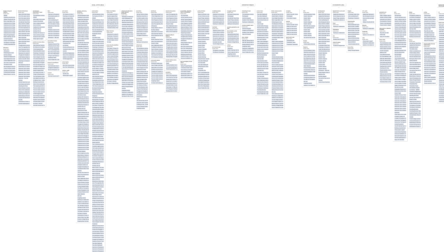
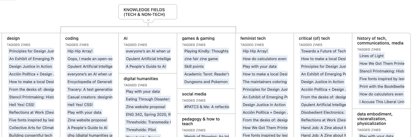
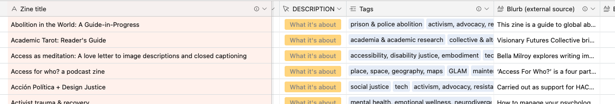
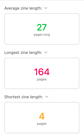
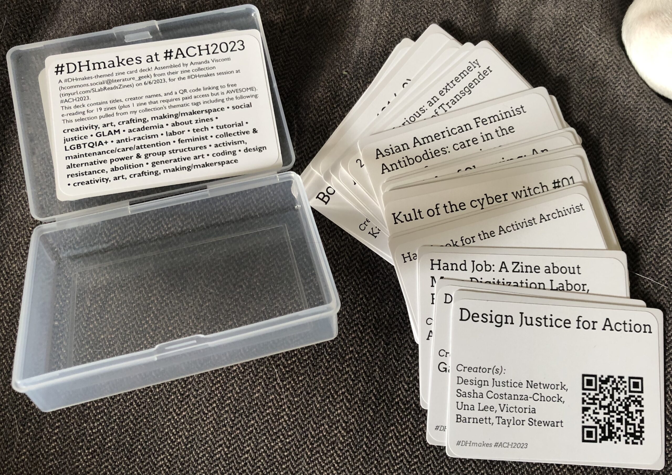
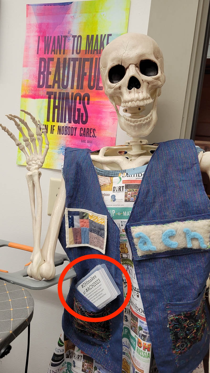
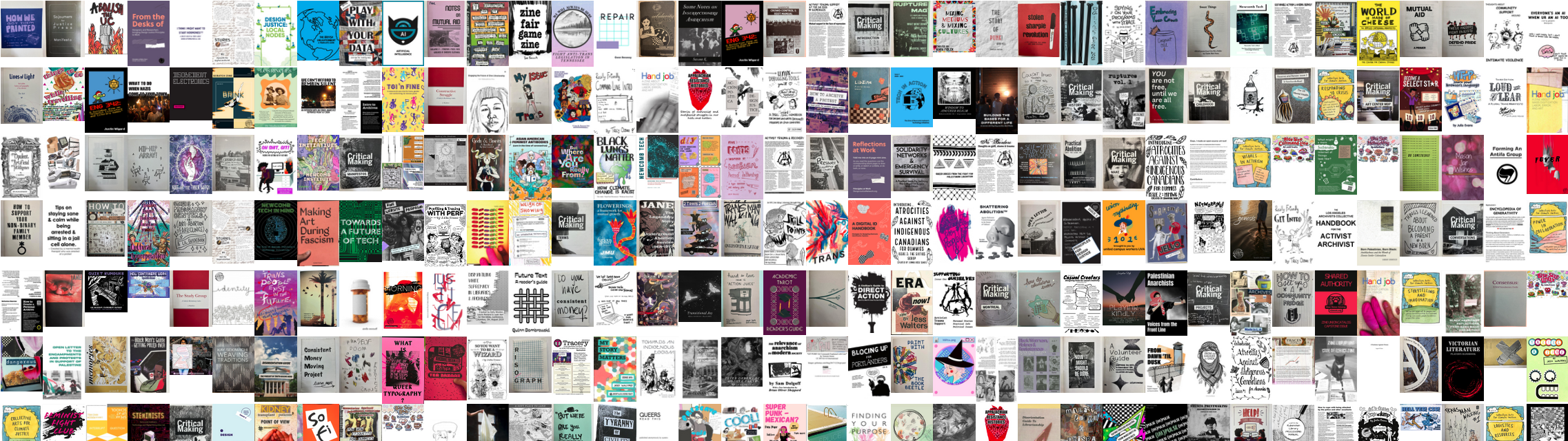
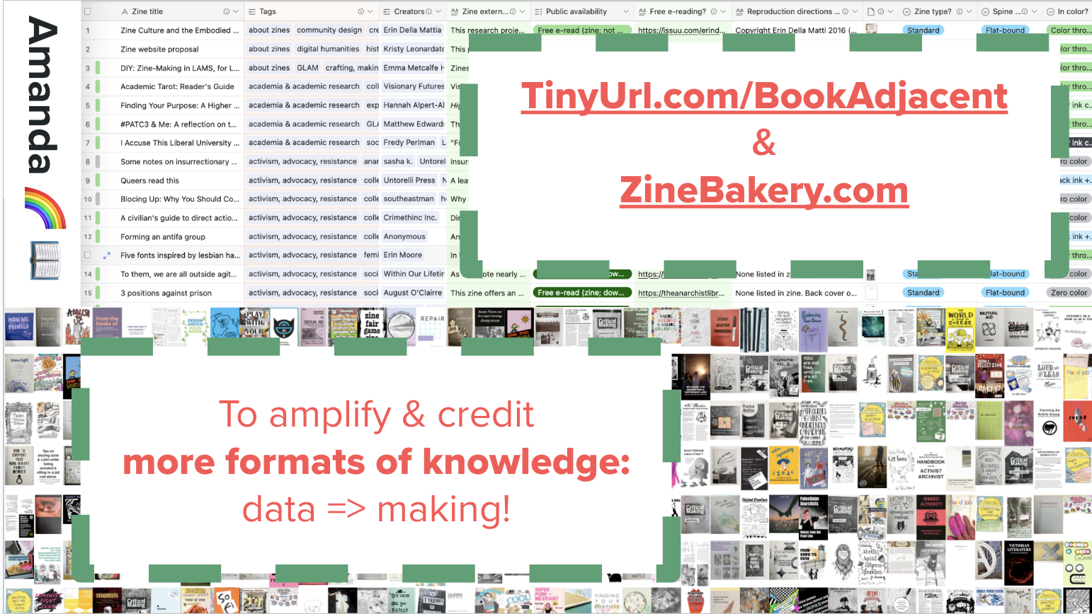
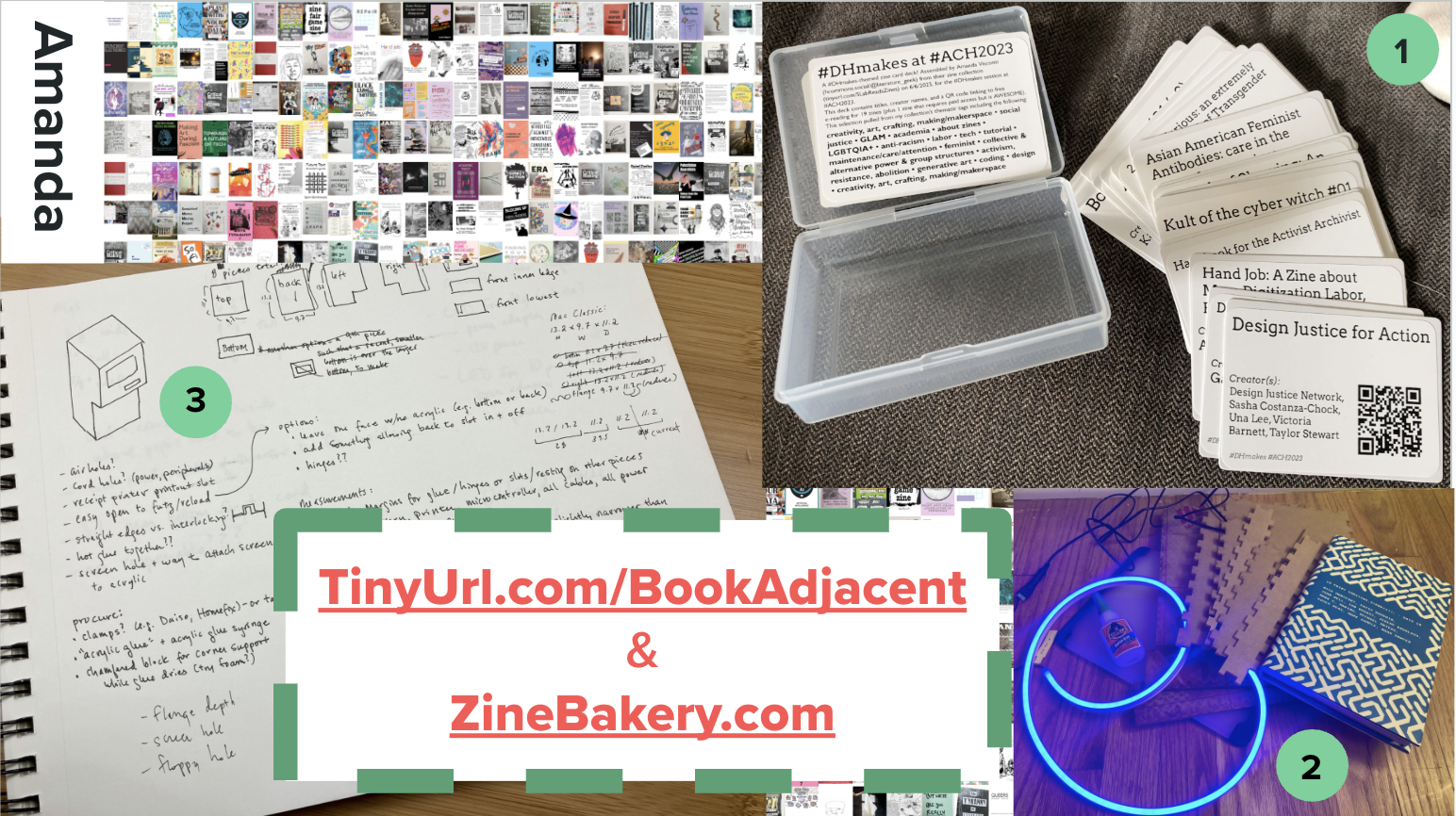
Zine Bakery zines

I maintain a database of info on hundreds of zines related to social justice, culture, and/or tech topics for my ZineBakery.com project—with over 60 metadata fields (slightly fewer for the public view) capturing descriptive and evaluative details about each zine. Use the … icon then “export as CSV” to use the dataset (I haven’t tried this yet, so let me know if you encounter issues).

OpenAlex

I don’t know much about this yet, but it looked cool and is from a non-profit that builds tools to help with the journal racket (Unsub for understanding “big deals” values and alternatvies, Unpaywall for OA article finding). “We index over 250M scholarly works from 250k sources, with extra coverage of humanities, non-English languages, and the Global South. We link these works to 90M disambiguated authors and 100k institutions, as well as enriching them with topic information, SDGs, citation counts, and much more. Export all your search results for free. For more flexibility use our API or even download the whole dataset. It’s all CC0-licensed so you can share and reuse it as you like!” openalex.org

Bonus data tools, tutorials

Matt Lincoln’s salty: “When teaching students how to clean data, it helps to have data that isn’t too clean already. salty offers functions for “salting” clean data with problems often found in datasets in the wild, such as pseudo-OCR errors, inconsistent capitalization and spelling, invalid dates, unpredictable punctuation in numeric fields, missing values or empty strings”.

The Data-Sitters Club for smart, accessible, fun tutorials and essays on computational text analysis for digital humanities.

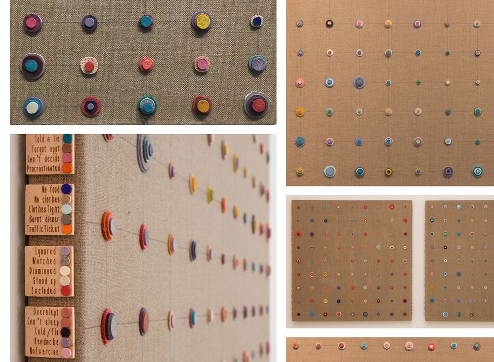
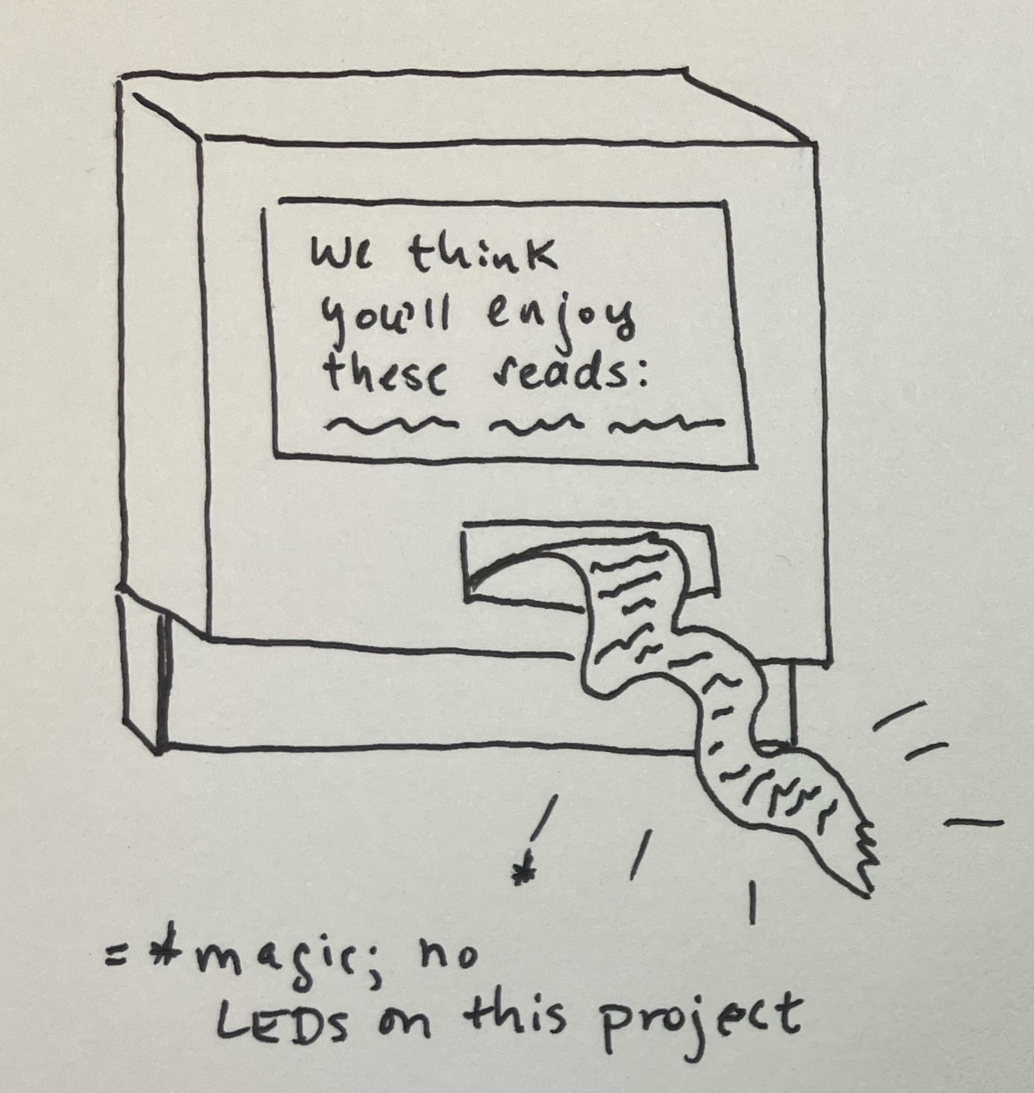
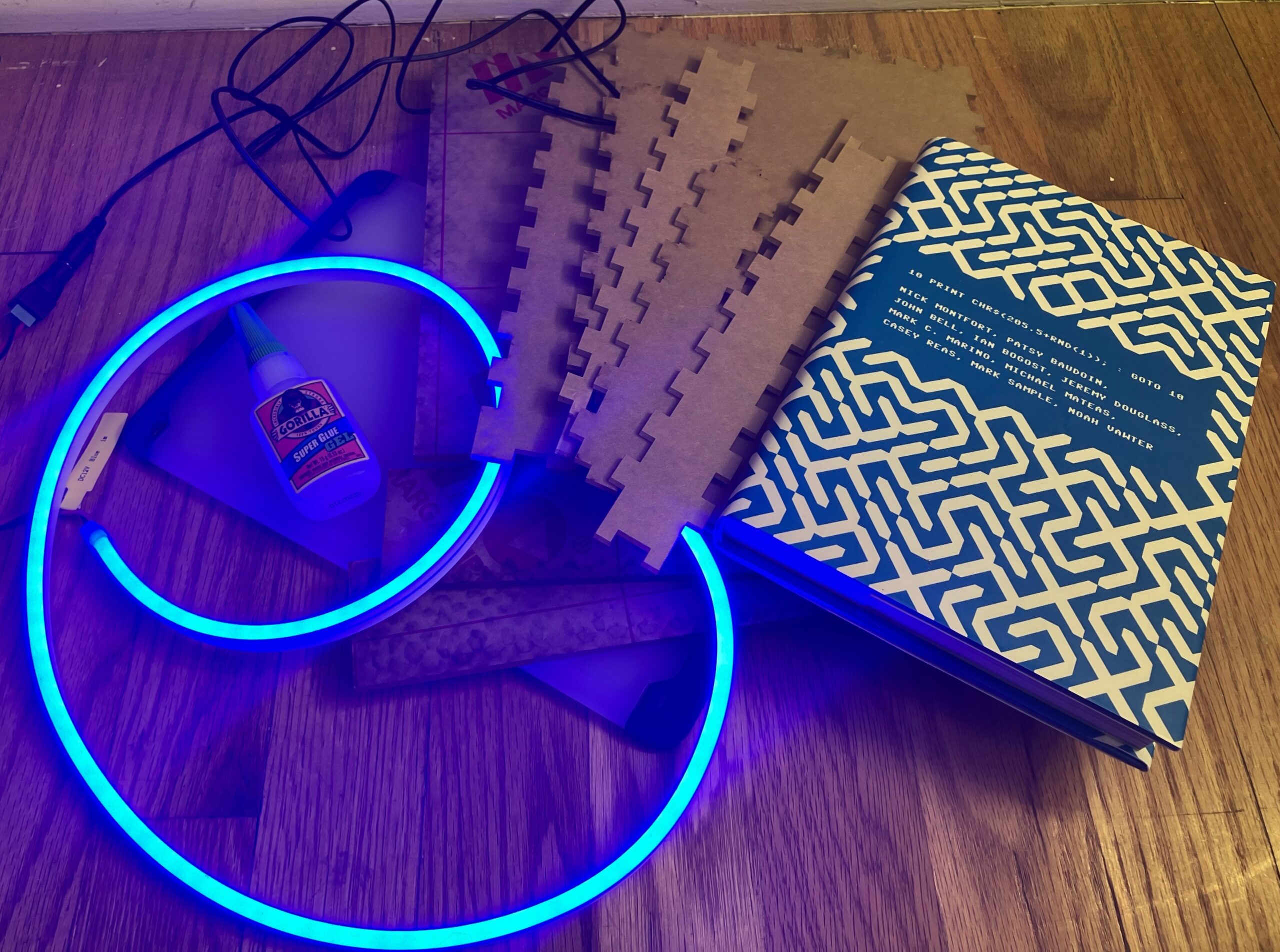
Claudia Berger’s blog post on designing a data physicalization—a data quilt!—as well as the final quilt and free research zine exploring the data, its physicalization process, and its provocations.

The Pudding’s resources for learning & doing data journalism and research

See also The Critical Fan Toolkit by Cara Marta Messina (discussed in datasets section above), which offers both tools and links to interesting datasets.

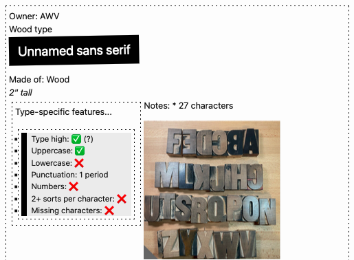
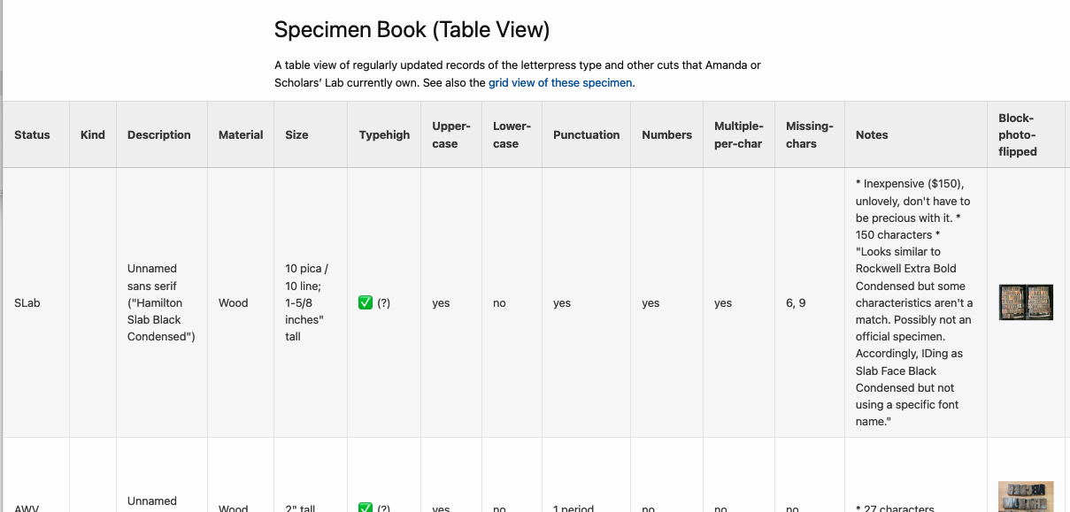
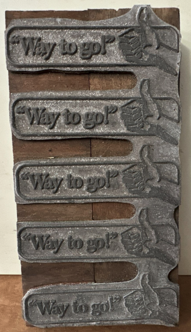
Letterpress data, not publicly available yet…

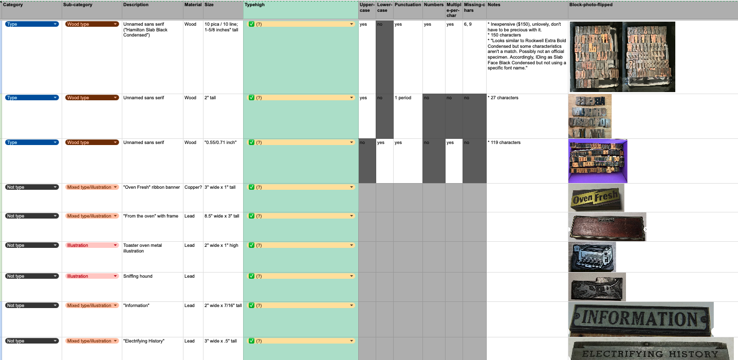
I maintain a database of the letterpress type, graphic blocks/cuts, presses, supplies, and books related to book arts owned by me or by Scholars’ Lab. I have a very-in-progress website version I’m slowly building, without easily downloadable data, just a table view of some of the fields.

I also have a slice of this viewable online and not as downloadable data: just a gallery of the queerer letterpress graphic blocks I’ve collected or created. But I could get more online if anyone was interested in teaching or otherwise working with it?

I also am nearly done developing a database of the former VA Center for the Book: Book Arts Program’s enormous collection of type, which includes top-down photos of each case of type. I’m hoping to add more photos of example prints that use each type, too. If this is of interest to your teaching or research, let me know, as external interest might motivate me to get to the point of publishing sooner.

  •  

Queer letterpress collecting & making

I’m interested in queer (and particularly trans) history and technologies. This overlaps with my book history research and book arts practice not just in the research papers, zines, and prints I create, but in the accessibility and representation of the printing materials I find or make, and the events and spaces I’m involved in as well.

I’m working to slowly collect historical LGBTQIA+ letterpress cuts (graphic printing blocks with illustrations and sometimes text)—and since these are scarce (for reasons of safety, permanence, and intended audience), trying to think about what cuts work as part of a queer letterpress collection today—what cuts I can queer.

I’m also designing and lasercutting my own new queer catchwords and cuts. And I hope to eventually combine these to scan some historical cuts, alter them in queer ways :D, and lasercut new queerer blocks.

Here’s a quick view of some of my historical & DIY collection (easier viewing as a full webpage here):

  •  

Our Journey to Praxathon

My cohort just finished our second week of Praxathon and I wanted to reflect on the development of our project and how we ended up focusing on conducting text analysis of the UVa students’ satirical publication, The Yellow Journal.

For me, this project started back in 2018 when I was accepted into The Yellow Journal as a second year undergraduate student at UVa. The Yellow Journal is an anonymously-published satirical newspaper that has operated on and off since 1913. Undergraduate students know The Yellow Journal for its members’ semesterly tradition of disrupting libraries during the first day of finals by raucously distributing the publication while masked and wearing all yellow… and often blasting Yellow by Coldplay or Black and Yellow by Wiz Khalifa on giant speakers. I started my tenure as a satirical writer with the headline and article below:

Hardest Part of Getting Accepted into the Comm School is Needing to Replace All of Your Friends, Student Says

As the season of applying to the McIntire School of Commerce approaches for second years, older students reflect on their prior application experiences. Kody, a fourth year in the Comm school, explains that the application itself was easy; he had no doubt in his mind that he would get in. The hardest part was letting go of all of his non-Comm friends afterwards. “I just can’t let failure into my life,” Kody explains. “Once you’re in the Comm School, you have to start setting standards for your friends, and most of my friends weren’t meeting mine.” Kody was on the fence about keeping his Batten friends, but eventually decided against it. “Hanging out with them is bad for optics, in my opinion,” Kody stated. “While Batten kids are also good at networking, I can’t let their morals get in my way. They’re all about government intervention… hey dummies, what about the invisible hand?” Drew, an Economics major, elaborates on his ended friendship with Kody: “The minute my roommate Kody got accepted, he turned to me and asked me to move out. I was heartbroken, we had been living together since first year. In fact, he’s also my cousin. But I understand… it had to be done.” Drew wasn’t sure if it was worth it to even continue college after his rejection from Comm. To him, having no diploma at all is better than getting an non-Comm Economics degree.

Outside of writing headlines and articles, Yellow Journal members were also in the midst of digitizing and archiving the entire history of the paper on our Google Drive. The publication started in 1913, but it was only published regularly starting in 1920 and then was subsequently banned in 1934 by the UVa administration due to its anonymity. The publication then resumed in 1987, having its own office next to The Cavalier Daily with a modest amount of revenue from selling ad placements. The paper was discontinued again in 1999, but a group of students revived it in 2010 which resulted in its current, ongoing iteration.

In late 2019, I realized that we were approaching 100 years since The Yellow Journal was published regularly and I applied to a few grants that could possibly fund a special anniversary issue. I wanted to use the extensive archive work that members had so painstakingly organized for future members to look back on. The idea was to publish some highlights from our archive, especially the jokes that still remained relevant today. With quarantine in March 2020, however, interest from my collaborators waned and I eventually abandoned that project. I knew that I wanted to return to working on a project about The Yellow Journal someday because it provided such unique insight on the student experience of the University. Also, even 100 years later, many of the early issues are still so funny.

My position as a former member of The Yellow Journal was definitely the reason that the subject was brought up as a possible topic for our Praxathon, but I don’t think this project would have necessarily worked with other cohorts. The final section on our charter is titled “Make Learning a Playful Process.” That was a big goal of our cohort: to approach the work in a fun, lighthearted way. I wasn’t completely sure about the viability of that pledge when we first wrote the charter. I didn’t know the rest of my cohort well at the time and I was still very operating in “traditional graduate classroom” mode. As we are approaching the end of the year, however, I think I can now safely say that we made every single part of Praxis fun and playful. I spend a good portion of my time in Praxis attempting to stifle my laughter at Oriane’s 10,000 things to commit to Github, Shane’s river drawing, or Brandon attempts to find new phrases because we accidentally made him insecure about saying “for what it’s worth.”

When I first pitched The Yellow Journal as an idea for Praxathon, I was mainly thinking about how it made sense as a project in a practical way: we already had access to high quality digitized records of all of the issues. The scope seemed manageable and it did not require too much preparatory work. As we’ve progressed in the project, I’ve slowly realized why it resonated with us as a group beyond logistics. Since we’re all graduate students at UVa, we are all familiar with and invested in the University’s history (especially told from a student perspective). We want to have fun with the material, which has led to many instances of us sitting in the fellows lounge and reading funny headlines out loud to each other.

Most of all, I think that the way we’ve developed the project has played into our individual and collective strengths. I never even thought about looking at student records from the 1920s and 30s but Gramond, being an incredible historian and lover of data, introduced us to that possibility. Oriane has done some amazing research on the history of the University at the time period that we’re looking at and, more generally, on analyzing satire. Because of her research of poetry, Amna was already interested in many of the text analysis methods that we’re using so she has expertly led us in thinking about how to apply those to The Yellow Journal. Kristin, as always, has shown herself to be an amazing problem solver, ready to tackle any coding task with such resolve and creativity. I just love assigning tasks to people so I have commandeered our Trello board.

Our poster will hopefully be done in the next few weeks, but it is clear to me now that the process, or journey, through the Praxathon is much more important than the end product. As I read through our charter again, I realize how true to our goals we’ve been and how interdisciplinary (and fun!) our final project is.

  •  

Designing a Data Physicalization: A love letter to dot grid paper

Claudia Berger is our Virtual Artist-in-Residence 2024-2025; register for their April 15th virtual talk and a local viewing of their data quilt in the Scholars’ Lab Common Room!

This year I am the Scholars’ Lab’s Virtual Artist-in-Residence, and I’m working on a data quilt about the Appalachian Trail. I spent most of last semester doing the background research for the quilt and this semester I get to actually start working on the quilt itself! Was this the best division of the project, maybe not. But it is what I could do, and I am doing everything I can to get my quilt to the Lab by the event in April. I do work best with a deadline, so let’s see how it goes. I will be documenting the major steps in this project here on the blog.

Data or Design first?

This is often my biggest question, where do I even start? I can’t start the design until I know what data I have. But I also don’t know how much data I need until I do the design. It is really easy to get trapped in this stage, which may be why I didn’t start actively working on this part of the project until January. It can be daunting.

N.B. For some making projects this may not apply because the project might be about a particular dataset or a particular design. I started with a question though, and needed to figure out both.

However, like many things in life, it is a false binary. You don’t have to fully get one settled before tackling the other, go figure. I came up with a design concept, a quilt made up of nine equally sized blocks in a 3x3 grid. Then I just needed to find enough data to go into nine visualizations. I made a list of the major themes I was drawn to in my research and went about finding some data that could fall into these categories.

A hand-written list about a box divided into nine squares, with the following text: AT Block Ideas: demographics, % land by state, Emma Gatewood, # miles, press coverage, harassment, Shenandoh, displacements, visit data, Tribal/Indig data, # of tribes, rights movements, plants on trail, black thru-hikers
What my initial planning looks like.

But what about the narrative?

So I got some data. It wasn’t necessarily nine datasets for each of the quilt blocks but it was enough to get started. I figured I could get started on the design and then see how much more I needed, especially since some of my themes were hard to quantify in data. But as I started thinking about the layout of the quilt itself I realized I didn’t know how I wanted people to “read” the quilt.

Would it be left to right and top down like how we read text (in English)?

A box divided into 9 squares numbered from left to write and top to bottom:  
1, 2, 3  
4, 5, 6  
7, 8, 9

Or in a more boustrophedon style, like how a river flows in a continuous line?

A box divided into 9 squares numbered from left to write and top to bottom: 1, 2, 3; 6, 5, 4; 7, 8, 9

Or should I make it so it can be read in any order and so the narrative makes sense with all of its surrounding blocks? But that would make it hard to have a companion zine that was similarly free-flowing.

So instead, I started to think more about quilts and ways narrative could lend itself to some traditional layouts. I played with the idea of making a large log cabin quilt. Log cabin patterns create a sort of spiral, they are built starting with the center with pieces added to the outside. This is a pattern I’ve used in knitting and sewing before, but not in data physicalizations.

A log cabin quilt plan, where each additional piece builds off of the previous one.
A template for making a log cabin quilt block by Nido Quilters

What I liked most about this idea is it has a set starting point in the center, and as the blocks continue around the spiral they get larger. Narratively this let me start with a simpler “seed” of the topic and keep expanding to more nuanced visualizations that needed more space to be fully realized. The narrative gets to build in a more natural way.

A plan for log cabin quilt. The center is labeled 1, the next piece (2) is below it, 3 is to the right of it, 4 is on the top, and 5 is on the side. Each piece is double the size of the previous one (except 2, which is the same size as 1).

So while I had spent time fretting about starting with either data/the design of the visualizations, what I really needed to think through first was what is the story I am trying to tell? And how can I make the affordances of quilt design work with my narrative goals?

I make data physicalizations because it prioritizes narrative and interpretation more than the “truth” of the data, and I had lost that as I got bogged down in the details. For me, narrative is first. And I use the data and the design to support the narrative.

Time to sketch it out

This is my absolute favorite part of the whole process. I get to play with dot grid paper and all my markers, what’s not to love? Granted, I am a stationery addict at heart. So I really do look for any excuse to use all of the fun materials I have. But this is the step where I feel like I get to “play” the most. While I love sewing, once I get there I already have the design pretty settled. I am mostly following my own instructions. This is where I get to make decisions and be creative with how I approach the visualizations.

(I really find dot grid paper to be the best material to use at this stage. It gives you a structure to work with that ensures things are even, but it isn’t as dominating on a page as a full grid paper. Of course, this is just my opinion, and I love nothing more than doodling geometric patterns on dot grid paper. But using it really helps me translate dimensions to fabric and I can do my “measuring” here. For this project I am envisioning a 3 square foot quilt. The inner block. Block 1, is 12 x 12 inches, so each grid represents 3 inches.)

There is no one set way with how to approach this, this is just a documentation of how I like to do it. If this doesn’t resonate with how you like to think about your projects that is fine! Do it your own way. But I design the way I write, which is to say extremely linearly. I am not someone who can write by jumping around a document. I like to know the flow so I start in the beginning and work my way to the end.

Ultimately, for quilt design, my process looks like this:

  1. Pick the block I am working on
  2. Pick which of the data I have gathered is a good fit for the topic
  3. Think about what is the most interesting part of the data, if I could only say one thing what would that be?
  4. Are there any quilting techniques that would lend itself to the nature of the data or the topic? For example: applique, English Paper Piecing, half square triangles, or traditional quilt block designs, etc.
  5. Once I have the primary point designed, are there other parts of the data that work well narratively? And is there a design way to layer it?

For example, this block on the demographics of people who complete thru-hikes of the trail using annual surveys since 2016. (Since they didn’t do the survey 2020 - and it was the center of the grid - I made that one an average of all of the reported years using a different color to differentiate it.)

I used the idea of the nine-patch block as my starting point, although I adapted it to be a base grid of 16 (4x4) patches to better fit with the dimensions of the visualization. I used the nine-patch idea to show the percentage of the gender (white being men and green being all other answers - such as women, nonbinary, etc). If it was a 50-50 split, 8 of the patches in each grid should be white, but that is never the case. I liked using the grid because it is easy to count the patches in each one, and by trying to make symmetrical or repetitive designs it is more obvious where it isn’t balanced.

A box divided into 9 squares, with each square having its one green and white checkered pattern using the dot grid of the paper as a guide. The center square is brown and white. On top of each square is a series of horizontal or vertical lines ranging from four to nine lines.

But I also wanted to include the data on the reported race of thru-hikers. The challenge here is that it is a completely different scale. While the gender split on average is 60-40, the average percentage of non-white hikers is 6.26%. In order to not confuse the two, I decided to use a different technique to display the data, relying on stitching instead of fabric. I felt this let me use two different scales at the same time, that are related but different. I could still play with the grid to make it easy to count, and used one full line of stitching to represent 1%. Then I could easily round the data to the nearest .25% using the grid as a guide. So the more lines in each section, the more non-white thru-hikers there were.

My last step, once I have completed a draft of the design, is to ask myself, “is this too chart-y?” It is really hard sometimes to avoid the temptation to essentially make a bar chart in fabric, so I like to challenge myself to see if there is a way I can move away from more traditional chart styles. Now, one of my blocks is essentially a bar chart, but since it was the only one and it really successfully highlighted the point I was making I decided to keep it.

A collection of designs using the log cabin layout made with a collection of muted highlighters. There are some pencil annotations next to the sketchesThese are not the final colors that I will be using. They will probably all be changed once I dye the fabric and know what I am working with.

Next steps

Now, the design isn’t final. Choosing colors is a big part of the look of the quilt, so my next step is dyeing my fabric! I am hoping to have a blogpost about the process of dyeing raw silk with plant-based dyes by the end of February. (I need deadlines, this will force me to get that done…) Once I have all of those colors I can return to the design and decide which colors will go where. More on that later. In the meantime let me know if you have any questions about this process! Happy to do a follow-up post as needed.

  •  

Data Description and Collection

I’m realizing that if I don’t start combining things I will only ever blog about my class, so here I’m collecting notes on the last two weeks of “Data for the Rest of Us” on data description and collection into a single post. We got into the first real technical skills for the course as the students built out their understanding of the data production pipeline. The goal is for them to build datasets based around their own interests, and we took some real steps in that direction with these units.

We had previously developed a working definition of data, so we began our session on description by reviewing it briefly before quickly introducing metadata. We focused on its use: confusingly, metadata is often called data about data, but it’s more accurately thought of as data attached to other data that gives context, facilitates discovery, and enables analysis. We got to these topics by way of metadata in everyday life. We talked about the metadata categories used on driver’s licenses and by online booksellers to facilitate identification and search. And then we made our way to the Netflix page for a popular movie to show how fuzzy things can get. I pointed out the various objective, quantifiable data (release date, length) and asked the students to discuss the other kinds of qualitative data on the page. We discussed how the genre categories are often a combination of algorithmically generated and hand-selected tags. We talked about controlled vocabulary, introduced the concept of a folksonomy, and discussed the pros and cons of each. Relevant examples were hashtags on Twitter and shelving categories on Goodreads. We ended by discussing metadata standards with a particular focus on Dublin Core.

Then we moved to the actual main activity for the day that actually asked the students to practice creating descriptive metadata. I set out three stacks of materials and asked them in groups to create a spreadsheet describing them. Each set of materials had a few types of items:

  • A set of books that were easy to describe
  • A zine
  • A book by George Eliot
  • A book by Haruki Murakami (to introduce concepts of translation)
  • One of a handful of especially challenging objects:

I had the students go through and describe their objects in groups using Dublin Core, fielded questions as they came up, and then rotated the unusual objects so that each group had seen them all. I periodically asked discoverability questions that prompted the students to rethink how they were organizing their data such as “which of you has a book by Mary Ann Evans?” The answer, of course, is that they all had a book by George Eliot. We talked about where that information should go in their dataset and discussed the individual choices made by different groups to solve these problems. We then touched on Riding SideSaddle specifically, which gave every group difficulty. Was the novel a genre? A format? A fuzzy concept? Their homework to pull all this together by using Dublin Core to create a small dataset that described 10 different examples of an interest of theirs.

The following class was about data collection, a topic I was especially excited about. We talked broadly about why we want to gather that in the first place:

  • It’s not being done!
  • To make the world better
  • To make something you care about last
  • Because otherwise someone else will do it instead/in spite of you

And then we discussed how to do so:

  • Surveys
  • Crowdsourcing
  • Web scraping
  • APIs
  • Ethics questions and IRB

Throughout, my main takeaway was that there is a wealth of stuff out there not being gathered. Any person can take on the task of gathering ephemeral content, sustaining, and analyzing it. But we have to be careful, ethical, and thoughtful about how we do so.

The centerpiece of the class was a workshop on webscraping as a method for collecting web data. I love teaching students how to scrape because I still remember how earth shattering it felt to learn how to do for the first time. So much stuff out there! And you can reach out to touch and handle it! I don’t assume any programming knowledge in the course, so I looked around for point-and-click scraping tools that might work for a one-off workshop. I landed on webscraper.io, a freemium tool that runs as an extension in Chrome. It’s very slick and powerful for this sort of sandbox work. The free version runs locally in your browser, so not good for full-on, large-scale work. But it requires very little technical knowledge, which made it work well for my purposes. I walked the students through how to scrape the Scholars’ Lab blog, and then I gave them a few other sites to practice with:

Their homework was to scrape another sandbox example and come up with ideas for real scraping projects. They’ve done great work with these scaffolding assignments that are building towards pitches for their final projects, and I’m excited to see where they go.

A few other reflections:

  • I keep having the students make spreadsheets to work with, and every time the students lose five minutes at the beginning of each activity as they create a blank spreadsheet and share their email addresses with each other. I should really create some blank spreadsheets ahead of time for them to reuse. It’s a small thing, but a few minutes each class really add up. And it often feels like the activities have a slow burn to really get going as the students start out engaging in tedious housekeeping.
  • One small thing I’ve been interested in this semester: everyone in the class is majoring or minoring in STEM in some way. I’m finding that I have to recalibrate a lot of my expectations. For example, my own background as a teacher of literature makes me want to gear everything towards discussion in a way that feels unusual to the students. But the students are excelling with the hands-on activities and technical work. I’m finding that I need to lecture more than normal, but also that I can go deeper on some of the technical questions than I might otherwise.

As always, the slide decks I’ve put together are all available on the course website.

  •  

Is It Data?

Snow is on the ground, but I bundled up to make it to campus for week two of “Data for the Rest of Us,” a semester-long, two-credit introduction to data literacy from a humanities perspective. The general arc of the course takes students through all parts of the data construction pipeline and culminates in small groups developing datasets based around their own interests to share back with the class. This week’s topic was “Data Identification,” which I structured in two segments: theory and practice.

First, we developed a working definition of what qualifies as data. Core to this was the Wikipedia page for data, which offers a neat and actionable summary in the first paragraph: “Data (/ˈdeɪtə/ DAY-tə, US also /ˈdætə/ DAT-ə) are a collection of discrete or continuous values that convey information, describing the quantity, quality, fact, statistics, other basic units of meaning, or simply sequences of symbols that may be further interpreted formally.”

For our purposes, I simplified this definition as containing three key elements. Data is…

  1. A collection
  2. of units of meaning
  3. that may be interpreted formally.

We discussed each of these pieces separately:

  • What counts as a collection? Who is doing the collecting? What does it mean to arrange things together? What structures facilitate collection or collecting? When does data become a dataset?
  • What counts as a unit of meaning? What is meaning in the humanities? What are the humanities anyway? What kinds of meaning units have we used in the past week?
  • What do we mean by formal interpretation? In this case, I specifically referred to the kinds of interpretation made possible by computers. We talked about what computers are good at, what they are bad at, and the kinds of compromises we might have to make to move between the two. We also talked about the kinds of formal interpretations that are possible: mapping, pattern recognition, averages, counting, and more.

In the second phase of the course, we practiced putting this definition into practice. I presented a series of objects to the students and asked them to apply our definition to it. Did this count as data on our terms? That is…was it a collection of meaningful information that could interpreted quantitatively? Why or why not? What units of information were there that could become data? How would we structure things if we wanted to convert this into data as defined above, such that we could work with it computationally?

We looked at:

  • A spreadsheet with stuff in it
  • An empty spreadsheet
  • An apple watch loaded with personal metrics
  • A diagram of cell phone metadata describing call counts, shortest paths between phones data structures
  • A bookcase with books in it
  • The bible opened to a particular page
  • A movie poster
  • A set of movie posters
  • A Wikipedia page about a Civil War battle
  • A spreadsheet full of information about twentieth-century wars
  • The front page of Vogue

Some conversations were less lively, but there were some objects that brought out great observations. With the Bible, for example, students noted how certain structural elements like chapter number, verse number, and page number might be interesting units of meaning you might want to preserve. And they got there by noting how you cite material from it. I also talked a bit about the OCR process by way of orienting them towards the path by which a physical object might become a collection of words in a plain text file.

The other “this is not a pipe” moment came when I asked the students to talk about what was contained in a movie poster. After they named all the textual elements of the image, I pulled up the CSS Color Picker tool and talked about how images are also specific organizations of color data. So in addition to the textual information we understood as people, the computer was understanding things on a very visual level and in very quantified terms. This made a nice link to the Robots Reading Vogue project and brought out a discussion of how we can make meaningful interpretations from visual information.

We closed with a short discussion of “On Missing Data Sets” by way of encouraging the students to think about what is out there, what is not, and the kinds of values, systems, and resources that go into deciding what is collected and what is not. For homework, the students have to brainstorm some datasets that don’t exist that they are interested in. I’m, frankly, a little suspicious of how successful they will be at this. It seems very hard to me! But I wanted to throw them the challenge to see how they do. Even if they struggle mightily I think it will be worthwhile.

If I had to run this particular class again, I probably would divide the class into smaller groups to help facilitate discussion. We ultimately got where I wanted to go, but my sense was that the students might have needed a bit more help from me structuring the discussion to get there. I think that might have been accomplished by flipping the format - rather than a group discussion about particular topics and images, I would give each group a set of images and a set of questions to answer about them before we came back to discuss. I’m still finding my way in this class of all STEM students since I’m used to exclusively teaching humanities majors.

Overall, the class discussion sent the students into something of an existential tailspin. Is it data? Yes. But also no. Could be! Depends on how much work you want to put into the question. And much more of that work is to come.

  •  

A #mincomp method for data display: CSV to pretty webpage

(Note: Brandon is going to blog about related work! Will link here once that’s live.)

This is a post to tell yall about a neat little web development thing that’s allowed me to easily make (and keep updated!) nifty things displaying kinds of data related to both professional development (easy CV webpage and printable format generation!) and bibliography/book arts (an online type speciment book, based on an easily-updatable Gsheet backend!). If you aren’t interested in the code, do just skim to see the photos showing the neat webpage things this can make.

Screenshot of a type specimen webpage created with Jekyll and a CSV of data
Figure 1: Screenshot of a type specimen webpage created with Jekyll and a CSV of data.

Screenshot of a CV webpage created with Jekyll and a CSV of data
Figure 2: Screenshot of a CV webpage created with Jekyll and a CSV of data.

Jekyll (skip this section if you know what Jekyll is)

Jekyll is a tool for making websites that sit in a middle ground between using a complex tool like WordPress or Drupal (a content management system, aka CMS) or completely coding each page of your website in HTML by hand, and I think easier to create and manage than either extreme. It’s set up to follow principles of “minimal computing” (aka #mincomp), which is a movement toward making technical things more manageably scoped with an emphasis on accessibility for various meanings of that. For example, using website development tools that keep the size of your website files small lets folks with slow internet still access your site.

If you want to know more about Jekyll, I’ve written peer-reviewed pieces on the what, why, and how to learn to make your own Jekyll-generated DH websites—suitable for folks with no previous web development experience!—as well as (with co-author Brandon Walsh) how to turn that into a collaborative research blog with a review workflow (like how ScholarsLab.org manages its blog posts). Basically, Jekyll requires some webpage handcoding, but:

  • takes care of automating bits that you want to use across your website so you don’t have to paste/code them on every page (e.g. you header menu)
  • lets you reuse and display pieces of text (e.g. blog posts, events info, projects) easily across the website (like how ScholarsLab.org has interlinked blog posts, author info, people bio pages, and project pages linking out to people and blog posts involved with that project)

DATA PLOP TIME

The cool Jekyll thing I’ve been enjoying recently is that you can easily make webpages doing things with info from a spreadsheet. I am vaguely aware that may not sound riveting to some people, so let me give you examples of specific uses:

  • I manage my CV info in a spreadsheet (a Gsheet, so I have browser access anywhere), with a row per CV item (e.g. invited talk, published article)
  • I also keep a record of the letterpress type and cuts (letterpress illustrations) owned by SLab and by me in a Gsheet

I periodically export these Gsheets as a CSV file, and plop the CSV file into a /_data folder in a Jekyll site I’ve created. Then, I’ve coded webpages to pull from those spreadsheets and display that info.

Screenshot of my letterpress specimen Gsheet
Figure 3: Screenshot of my letterpress specimen Gsheet

Data Plop Op #1: Online Letterpress Type Specimen Book

You don’t need to understand the code in the screenshot below; just skim it, and then I’ll explain:

Screenshot of some of the code pulling my letterpress Gsheet data into my Jekyll webpage
Figure 4: Screenshot of some of the code pulling my letterpress Gsheet data into my Jekyll webpage

I include this screenshot to show what’s involved to code a webpage that displays data from a CSV. What this shows is how I’m able to call a particular spreadsheet column’s data by just typing “”, rather than pasting in the actual contents of the spreadsheet! LOTS of time saved, and when I edit the spreadsheet to add more rows of data, I just need to re-export the CSV and the website automatically updates to include those edits. For example, in the above screenshot, my CSV has a column that records whether a set of letterpress type is “type high” or not (type high = .918”, the standard height that lets you letterpress print more easily with different typefaces in one printing, or use presses that are set to a fixed height). In the code, I just place “” where I want it in the webpage; you can see I’ve styled it to be part of a bullet list (using the “<li>” tag that creates lists).

In the screenshot, I also use some basic logic to display different emoji, depending on what’s in one of the CSV columns. My “uppercase” column says whether a set of letterpress type includes uppercase letters or not. My code pulls that column (“”) and checks whether a given row (i.e. set of letterpress type or cut) says Uppercase = yes or no; then displays an emoji checkmark instead of “yes”, and emoji red X instead of “no”.

Here’s how one CSV line displayed by my specimen book webpage looks (I haven’t finished styling it, so it doesn’t look shiny and isn’t yet live on my very drafty book arts website):

Screenshot of a webpage displaying letterpress Gsheet data in a nicely designed grid of boxes

And I was also able to code a table version, pulling from the same data:

Screenshot of a webpage displaying letterpress Gsheet data in a nicely designed table format

If the code discussion is confusing, the main takeaway is that this method lets you

  1. manage data that’s easier to manage in a spreadsheet, in a spreadsheet instead of coded in a webpage file; and
  2. easily display stuff from that spreadsheet, without needing to make a copy of the data that could become disjoint from the spreadsheet if you forget to update both exactly the same.

Data Plop Op #2: Keeping your CV updated

I used to manage my CV/resume as Google Docs, but that quickly turned into a dozen GDocs all with different info from different ways I’d edited what I included for different CV-needing opportunities. When I had a new piece of scholarship to add, it wasn’t clear which GDoc to add it to, or how to make sure CV items I’d dropped from one CV (e.g. because it needed to focus on teaching experience, so I’d dropped some less-applicable coding experiences from it) didn’t get forgotten when I made a CV that should include them.

UGH.

A happy solution: I have 1 CV Gsheet, with each row representing a “CV line”/something I’ve done:

Screenshot of a Gsheet containing CV data

I periodically export that CSV and plop it into a Jekyll site folder. Now, I can do 2 cool things: the first is the same as the letterpress specimen book, just styling and displaying Gsheet data on the web. This lets me have both webpages showing a full version of my CV, and a short version of my CV, and theoretically other pages (e.g. code a page to display a CV that only includes xyz categories):

Screenshot of a webpage displaying a CV

And! I’ve also coded a printable CV. This uses a separate CSS stylesheet that fits how I want a printed CV to look different from a website, e.g. don’t break up a CV line item between two pages, don’t include the website menu/logo/footer. Same text as above, styled for printing:

Screenshot of a webpage displaying a CV, with styling that looks like it would print to make a nice-looking printed CV

When I need a whittled down CV that fits a page limit, or that just shows my experience in one area and not others I’m skilled in, I can just make a CSV deleting the unneeded lines—my spreadsheet ahs category and subcategory columns making it easy to sort these, and also to tag lines that could appear in different sections depending on CV use (e.g. sometimes a DH project goes under a peer-reviewed publication section, or sometimes it goes under a coding section as I want my publication section to only include longform writing). But I add new lines always to the same core Gsheet, so I don’t get confused about what I’ve remembered to record for future CV inclusion where.

I currently don’t have this CV website online—I just run it locally when I need to generate a printable CV. But I’ll be adding it to my professional site once I have a bit more time to finish polishing the styling!

In conclusion

Jekyll + CSV files =

Screenshot of a letterpress cut consisting of a repeating row of 5 images; the image that repeats is a hand giving a thumbs-up next to the text "way to go!"

(One of the letterpress cuts recorded by my specimen book Gsheet/webpage, as discussed above!)

  •  

🧵Data Physicalization Resources

Claudia Berger maintains a Zotero “physical data viz” group library containing nearly 100 articles, datasets, and other relevant reads.

I added several items to that library this past week, and wanted to capture my Bluesky thread about them for the blog:

Personal stress data as commentary on stress-impacted health issues

Laurie Frick’s “Stress Inventory” uses leather discs on stretched linen, piled and colored to record daily irritation levels & highlight stress’ contribution to chronic health issues. (HT Laura Miller)

Photos of Laurie Fricks' data art "Stress Inventory", showing piled of colored leather discs on stretched linen with a legend to explain what colors and disc sizes means about the irritation levels they record

Weaving data analysis of speculative fiction

Quinn Dombrowski’s “The Locked Loom 1: Gideon the Ninth” discusses a weaving text visualization and analysis based on elements of everyone’s favorite “lesbian necromancers in space” fantasy novel (the Locked Tomb Series; highly recommend, it is not silly/pulp despite that being a fitting descriptor, but rather epic, page-turning speculative fiction/sci fi).

Baking data-displaying cakes for climate change advocacy

An interview with “baker-turned-glacier guide” Rose Mcadoo on her “Cakes for Climate Change” combating climate demise through educational cakes and desserts that explain the natural processes behind glaciology and climate change.

Workflow for turning ambient audio data into 3D prints

Audrey Desjardins’ and Timea Tihanyi’s “ListeningCups: A Case of Data Tactility & Data Stories” documents a workflow for capturing data, creating 3D printed porcelain cups embedded with datasets of everyday ambient sounds; and shares reflections around experiences such as “data accidents” (HT Beth Mitchell)

Reflections from installing a data physicalization exhibit

Claudia Berger and Chris Alen Sula’s piece on lessons learned from installing a data physicalization of a HASTAC conference’s metadata, published in Nightingale (the journal of the Data Visualization Society).

Building data intended for (sometimes physical) art

“Datasets as Imagination” by Lisa Shroff argues for collectively built datasets shaped specifically for reuse by artists for art, including for physical data exhibits. (HT Zoe LeBlanc)

Library research guide for data physicalization

“Data Driven Creativity: Making Data Physicalizations” is a library guide by Ariel Ackerly, Sarah Reiff Conell, and Ofira Schwartz, gathering datasets, projects, and writing about data physicalizations.

(“HT” is shorthand for “hat tip”, a minimal-characters way people say “I found this link via this other person sharing it in the past; thanks to them”.)

  •  

Zine Bakery: catalog as dataset research

A catalog is also a dataset, which means because of my Zine Bakery project’s zine catalog, I’ve got a hand built, richly described, tidily organized dataset I know well. Seeing my zine catalog as a dataset opens it to my data science and digital humanities skillset, including data viz, coding, and data-based making. Below, I share some of the data-driven scholarship I’ve pursued as part of my Zine Bakery project.

Photo of Amanda Wyatt Visconti presenting virtually at the DH 2024 conference
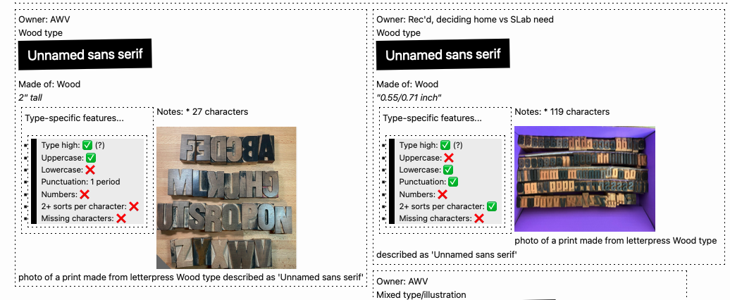
Giving a talk on data-driven making for the DH 2024 conference

A peek under the hood

Screenshot of just a small portion of my thematic tagging. I’ve got 134 different tags used on catalog zines (as of 9/16/2024): Screenshot of a portion of the Zine Bakery catalog, showing a variety of thematic tags including AI, anti-racism, and coding

Below, a zoomed-out screenshot of my tagging table, which does not capture the whole thing (which is about twice as wide and twice as a tall as what’s shown); and a zoomed-in view: Screenshot of a portion of the Zine Bakery catalog, showing a way-zoomed-out screenshot of a portion of the zine catalogue's underlying thematic tags to zine titles tableScreenshot of a portion of the Zine Bakery catalog, showing a zoomed-in screenshot of a portion of the zine catalogue's underlying thematic tags to zine titles table

The tags are just one of many fields (78 total fields per zine, as of 9/16/2024) in my database: Screenshot of a portion of the Zine Bakery catalog, showing several titles of zines

I’m able to easily pull out stats from the catalog, such as the average zine length in my collection being 27 pages (and shortest, longest zine lengths):

Screenshot of a portion of the Zine Bakery catalog, showing average zine length is 27 pages long, longest zine is 164 pages long, and shortest zine length is 4 pages long

Data-driven making research

My Spring 2024 peer-reviewed article “Book Adjacent: Database & Makerspace Prototypes Repairing Book-Centric Citation Bias in DH Working Libraries” discusses the relational database I built underlying the Zine Bakery project, as well as 3 makerspace prototypes I’ve built or am building based on this data.

One of those projects was a card deck and case of themed zine reads, with each card displaying a zine title, creators, and QR code linking to free reading of the zine online: Example themed reading card deck, prepared for the ACH 2023 conference's #DHmakes (digital humanities making) session. An open plastic playing card case holds a playing-card-style card with information about the "#DHMakes at #ACH2023" project governing the readings chosen for inclusion in the deck; next to the case is a fanned-out pile of playing-card-style cards showing tech, GLAM, and social justice zine titles such as "Kult of the Cyber Witch #1" and "Handbook for the Activist Archivist"; on the top of the fanned pile you can see a whole card. The whole card is white with black text; the title "Design Justice for Action" is in large print at the top of the card, followed by a list of the zine's creators (Design Justice Network, Sasha Costanza-Chock, Una Lee, Victoria Barnett, Taylor Stewart), the hashtags "#DHMakes #ACH2023, and a black square QR code (which links to an online version of that zine).

Photo of a fake, adult-size skeleton (Dr. Cheese Bones) wearing the ACH 2023 #DHMakes crew's collaborative DH making vest, which boasts a variety of neat small making projects such as a data visualization quilt patch and felted conference name letters. One of my themed reading card decks is visible half-tucked into its vest pocket. Photo and Dr. Bones appearance by Quinn Dombrowski.

My online zine quilt dataviz will eventually be an offline actual quilt, printed on fabric with additional sewn features that visualize some of the collection’s data: Screenshot of a digital grid of photos of zine front covers; it's very colorful, and around 200 zine covers are shown

The dataset is also fueling design plans for a public interactive exhibit, with a reading preferences quiz that results in a receipt-style printout zine reading list: My sketches and notes planning the layout of the Mini Book List Printer's acrylic case. A photo of a spiral-bound sketchbook, white paper with black ink. The page is full of notes and drawings, including sketches of a simplified Mac Classic-style computer case, as well as the various pieces of acrylic that would need to be cut to assemble the case and their dimensions. The notes contain ideas about how to assemble the case (e.g. does it need air holes?), supplies I needed to procure for the project, and note working out how to cut and adhere various case piece edges to achieve the desired final case dimensions.

Author's sketch of what the final Mini Book List printer should look like. A rough drawing in black ink on white paper, of a computer shaped like a simplified retro Mac (very cubic/boxy); the computer screen reads "We think you'll enjoy these reads:" followed by squiggles to suggest a list of suggested reads; from the computer's floppy drive hole comes paper receipt tape with squiggles listed on it to suggest a reading recommendation list printout on receipt-width paper. There are sparkly lines drawn around the receipt paper, with an annotation stating these denote "magic" rather than light, as there are no LEDs in this project.

I’m also experimenting with ways to put digital-only zines visibly on physical shelves: Photo of materials for the Ghost Books project artfully arranged on a floor, including a swirl of blue LEDs with silicone diffusion making them look like neon lights, superglue, acrylic and glass cut to size to be assembled into a rectangular-prism/book shape with smoothe or crenellated edges, and one of the books I'm basing the initial prototype on (10 PRINT) because of it's interesting blue and white patterned cover.

  •  

Zine Bakery: research roadmap

Some future work I’m planning for my Zine Bakery project researching, collecting, and amplifying zines at the intersections of tech, social justice, and culture.

Critical collecting

  • Ethical practices charter: how do I collect and research?
    • Finish drafting my post on ethics-related choices in my project, such as
      • not re-hosting zines without creator informed, explicit consent, so that catalogue users use zine creator’s versions and see their website; and
      • taking extra care around whether zines created for classes gave consent outside of any implicit pressures related to grades or the teacher serving as a future job reference
    • Read the Zine Librarians Code of Ethics in full, and modify my charter wit citations to their excellent project.
  • Collecting rationale: why do I collect, and what do I/don’t I collect?

  • ID areas I need to collect more actively, for Zine Bakery @ Scholars’ Lab goals of a welcoming, diverse collection reflecting SLab’s values and our audience

  • Contact zine creators: I already don’t display, link, etc. zines creators don’t positively indicate they want people to. But I could also contact creators to see if they want something added/edited in the catalogue, or if their preferences on replication have changed since they published the zine; and just to let them know about the project as an example of something citing their work.

  • Accessibility:
    • Improve zine cover image alt text, so rather than title and creators, it also includes a description of important visual aspects of the cover such as color, typography, illustration, general effect. Retry Google Vision AI, write manually, or look at existing efforts to markup (e.g. comics TEI) and/or extrapolate image descriptions.
    • Look into screen-reading experience of catalogue. Can I make a version (even if it requires scheduled manual exports that I can format and display on my website) that is more browsable?
    • Run website checks for visual, navigational, etc. accessibility

Data, website, coding

  • Better reader view:
    • Create a more catalogue-page-like interface for items
    • Make them directly linkable so when I post or tweet about a zine, I can link people directly to its metadata page
  • Self-hosted data and interface: explore getting off AirTable, or keeping it as a backend and doing regular exports to reader and personal collecting interfaces I host myself, using data formats + Jekyll

  • Make metadata more wieldly for my editing:
    • I wish there were a way to collapse or style multiple fields/columns into sections/sets.
    • I might be able to hackily do this (all-caps for umbrella field for a section? emojis?); or
    • Using an extension allowing styling view (unsure if these are friendly for bulk-editing);
    • the self-hosted options mentioned above might let me better handle this (use or make my own, better viewing interface)
  • Crosswalk my metadata to xZINECOREx metadata?: so is interoperable with the Zine Union Catalogue and other metadata schema users

  • File renaming:
    • I started with a filename scheme using the first two words of a zine title, followed by a hyphen, then the first creator’s name (and “EtAl” if other creators exist)
      • I quickly switched to full titles, as this lets me convert them into alt text for my zine quilt
      • I need to go back and regularize this for PDFs, full-size cover images, and quilt-sized cover images.
  • Link cover images to zine metadata (or free e-reading link, if any?) from zine quilt vis

Metadata & cataloguing

  • Create personal blurbs for all zines that don’t have one written by me yet

  • Further research collected zines so I can fill in blank fields, such as publication date and location for all zines

Community

  • Explore setting up for better availability to the Zine Union Catalogue, if my project fits their goals

  • Further refine logo/graphics:
    • finish design work
    • create stickers to hand out, make myself some tshirts :D
  • Learn more about and/or get involved with some of the
    • cool zine librarian (Code of Ethics, ZLUC, visit zine library collections & archives) and
    • zine fest (e.g. Charlottesville Zine Fest, WTJU zine library) efforts

Research & publication

  • Publication:
  • More visualization or analysis of metadata fields, e.g.
    • timeline of publication
    • heatmap of publication locations
    • comparison of fonts or serif vs. sans serif fonts in zines
  • Digital zine quilt: play with look of the zine quilt further:
    • Add way to filter/sort covers?
    • Add CSS to make it look more quilt-like, e.g. color stiching between covers?

Making

  • Thermal mini-receipt printer:
    • Complete reads/zines recommendation digital quiz and mini-receipt recommendation printout kiosk.
    • Possibly make a version where the paper spools out of the bread holes of a vintage toaster, to go with the Zine Bakery theme?
    • Thanks to Shane Lin for suggesting a followup: possibly create version that allows printing subset of zines (those allowing it, and with print and post-print settings that are congenial to some kind of push-button, zine-gets-printed setup.
  • Real-quilt zine quilt: Print a SLab-friendly subset of zine covers as a physical quilt (on posterboard; then on actual fabric, adding quilt backing and stitching between covers?)

  • More zine card decks: create a few more themed subsets of the collection, and print more card decks like my initial zine card deck
  •  

Zine Bakery: topical zine collections

The Zine Bakery catalog is a public view of a subset of the Zine Bakery dataset. It includes most/all of the zines in my personal catalogue, but only a subset of the metadata fields—leaving out fields irrelevant to the public like how many copies of a zine do I have at home, or private data like links to private PDF backups of zines.

I recently set up a “Zine Reader’s View” here, which is 1) only the zines that allow anyone to read them online for free, and 2) only includes my catalogue metadata of most interest to folks looking to read zines (e.g. the metadata about printing zines is hidden).

I also set up my catalogue to link readers directly to just zines with certain themes, like feminist tech zines and digital humanities zines!

Screenshot of the multi-colored buttons on my ZineBakery.com website, linking people to specific subsets of my zine catalogue such as "tech knowledges" zines and "feminist tech" zines

Screenshot of the multi-colored buttons on my ZineBakery.com website, linking people to specific subsets of my zine catalogue such as “tech knowledges” zines and “feminist tech” zines.

In addition to viewing the whole public catalogue, you can now easily see:

(The “+” means that was the count of zines when I created these tags in early August, but I’m adding more zines all the time.)

  •  

My digital humanities makerspace research

My DH 2024 conference talk on my recent book-adjacent data physicalizations and makerspace research, as part of co-facilitating the #DHmakes mini-conference. What is #DHmakes? Briefly: anyone (you?) DH-adjacent sharing their (DH or not) crafty or making work with the #DHmakes hashtag, getting supportive community feedback. Resulting collaborations have included conference sessions and a journal article. For an in-depth explanation of #DHmakes’s history, rationale, goals, examples, see the peer-reviewed article I recently co-authored with Quinn Dombrowski and Claudia Berger on the topic.

Hey! I’m Amanda Wyatt Visconti (they/them). I’m Director of the Scholars’ Lab at the University of Virginia Library.

My background’s in librarianship, literature and textual scholarship, so a lot of my making is reading- or book-adjacent. I know the ways we do and share knowledge work can take really any format, as can the things that influence our scholarly thinking. I have been informed or inspired by, for example, a literal bread recipe; fictional creative work that explores new possibilities, or conveys an ethos I took back to my research; tutorials, informal discussions, datasets, infrastructural and administrative work, zines, social media posts, and countless other of the ways humans create and share thinking*.

First slide from my DH2024 #DHmakes talk, showing screenshots of my zine grid and zine database, and saying "to amplify & credit more formats of knowledge: data => making!"

Why make book-adjacent prototypes?

“Generous” citation—in whom we cite, and what formats of work we cite—is actually just accurate citation. Academia routinely lags in citing all the emails, attended conference talks, social media posts, elevator conversations, podcasts, reviewer comments, and more that inspire and inform our scholarship. With my particular context of a library-based lab: physical scholarship displays in academic libraries tend to disinclude relevant reads that aren’t in a print scholarly book or journal format.

It’s hard to display many of the formats I just listed, but also many people don’t think of them as worth displaying? This sends a message that some scholarly formats or methods are lesser, or not relevant to the building and sharing of knowledge. We know there’s systemic racism, sexism, and other harms in publishing and academia. Limiting ourselves to displaying and amplifying just some of the most gatekept formats of knowledge sharing—books and journal articles—fails at presenting a welcoming, inclusive, and accurate picture of what relevant work exists to inform and inspire around a given topic.

So, I’ve been using making projects to change what scholarly formats and authors the Scholars’ Lab will be able to amplify in its public space…

Data-driven research making

I started by focusing on collecting and describing a variety of DHy digital and physical zines, though I hope to expand the dataset to other formats eventually. (Briefly, you can think of zines as DIY self-published booklets, usually intended for replication and free dissemination, usually in multiple copies as opposed to some artists’ books being single-copy-only or non-replicable.) In the upper-left of the slide is a slice of my digital “zine quilt”, a webpage grid of zine covers from zines in my collection.

Second slide from my DH2024 #DHmakes talk, showing photos of my digital zine cover grid, themed reading card decks, a notebook open to design drawings, and a pile of makerspace supplies including a neon loop and a book cover

Having a richly described zine-y database I know by heart, because I researched and typed in every piece of it, has opened my eyes to ways data can suggest data-based research making.

I’ve got 3 crafting projects based on this zine database so far:

1st, I created a playing card deck that fits in a little case you can slip into your pocket. Each card has the title and creators of a zine, and a QR code that takes you to where you can read the zine for free online. This lets me hand out fun little themed reading lists or bibliographies, as shuffle-able card decks… or potentially play some really confusing poker, I guess?

2nd, I’m learning to work better with LEDs, sheet acrylic, and glass by reverse-engineering a simple and less gorgeous version of Aidan Kang’s Luminous Books art installation. Kang’s sculptures fills shelves with translucent, glowing boxes that are shaped and sized like books with colorful book covers. I’ve been prototyping with cardboard, figuring out how to glue glass and acrylic securely, and figuring out programmable lights so I can make these book-shaped boxes pulse and change color. I hope to design and print fake “covers” for non-book reads like a DH project or a dataset. This would let me set these glowy neon fake books on our real book shelves, where the colored light might draw people to look at them, and follow a link to interact with the read further.

3rd, I’m hooking up a tiny thermal printer, like the ones that print receipts, to a Raspberry Pi and small display screen. I’m hoping to program a short quiz people can take, that makes the printer print out a little “receipt” of reading recommendations you can take away, based on metadata in my reading database. I’d been working to construct a neon acrylic case that looks like a retro Mac to hold the display and printer, again figuring out how to make a simpler approximation of someone else’s art, in this case SailorHg’s “While(Fruit)”. But naming my collection a “Zine Bakery” got me excited about instead hiding the receipt printer inside a toaster, so the receipt paper could flow out of one of the toaster’s bread holes. You can read more about these book-adjacent making projects at TinyUrl.com/BookAdjacent, or the zine project at ZineBakery.com.

Unrelatedly: resin!

Completely unrelated to reading: I’ve been learning how to do resin casting! You can think of resin like chemicals you mix up carefully, pour carefully into molds over multiple days and multiple layers of pouring with various pigments and embedded objects, and carefully try not to breathe. It hardens into things like this silly memento mori full-size skull I made, where I’ve embedded novelty chatter teeth and a block of ramen for a brain. Or for this necklace, I embedded multicolor LED bulbs in resin inside of D&D dice molds.

Third slide from my DH2024 #DHmakes talk, showing photos of a translucent frosted resin skull with a ramen brain and chatter teeth, and a light-up D&D dice necklace

(See my recent post on resin casting for more about this work!)

Come #DHmakes with us!

I’ve discovered I really like the experience of learning new crafts: what about it is unexpectedly difficult? How much can I focus on the joy of experimenting and learning, and grow away from frustration that I can’t necessarily make things that are pretty or skillful yet? So I’ve got a weird variety of other things cooking, including fixing a grandfather clock, building a small split-flap display like in old railway stations (but smaller), mending and customizing clothes to fit better, prototyping a shop-vac-powered pneumatic tube, carving and printing linoleum, and other letterpress printing.

To me, the digital humanities is only incidentally digital. The projects and communities I get the most from take a curious and capacious approach to the forms, methods, fields we can learn from and apply to pursue knowledge, whether that’s coding a website or replicating a historical bread baking recipe. #DHmakes has helped me bring more of that commitment to experimentation into my life. And with that comes the joy of making things, being creative, and having an amazing supportive community that would love yall to share whatever you’re tinkering with using the #DHmakes hashtag, so I hope you join us in doing that if you haven’t already!

* Some of the text of this talk is replicated from my Spring 2024 peer-reviewed article, “Book Adjacent: Database & Makerspace Prototypes Repairing Book-Centric Citation Bias in DH Working Libraries”, in the DH+Lib Special Issue on “Making Research Tactile: Critical Making and Data Physicalization in Digital Humanities”.

  •